Ever wondered why some websites draw you in while others make you click away faster than you can say “goodbye”?
The secret sauce? Color.
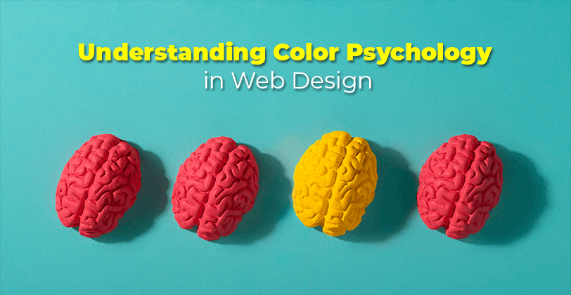
Color isn’t just about aesthetics; it’s a powerful tool that affects emotions, behaviors, and even decision-making.
Let’s break down color psychology in web design so you can create sites that resonate and convert.
What is Color Psychology?
Color psychology is the study of how colors influence human behavior and feelings. Each color sends a message and evokes a reaction.
Here’s a quick rundown:
Red: Passion, energy, urgency. Think about how it grabs attention.
Blue: Trust, calm, reliability. Many banks use blue for this reason.
Green: Growth, health, tranquility. It’s a go-to for eco-friendly brands.
Yellow: Optimism, warmth, creativity. But too much can be overwhelming.
Black: Sophistication, elegance, authority. Often seen in luxury brands.
White: Simplicity, purity, cleanliness. Great for minimalist designs.
The Emotional Spectrum of Color
Color can spark emotions in ways we often overlook. A quick experiment: look at different colors and note your immediate feelings.
Colors can evoke nostalgia, happiness, or even anxiety. This emotional response can affect user engagement on your site.
Why Does It Matter in Web Design?
Colors set the mood for your site and can drive user actions.
Think about it. You want your visitors to feel excited, calm, or trustworthy when they land on your page.
Here’s why color choice is crucial:
First Impressions Count: Your color scheme can grab attention or turn people off in seconds.
Brand Identity: Consistent color usage builds brand recognition. Ever seen a red can and immediately thought of Coca-Cola?
Navigation Ease: Colors can help users find their way around your site. Use color to guide the eye.
The Psychology of Color in Branding
Brands like Apple and Tiffany & Co. leverage color to create a sense of identity and loyalty.
Think about it: Apple’s sleek silver and white represent modernity and innovation, while Tiffany’s robin egg blue signals luxury and exclusivity.
Tips for Choosing the Right Colors
1. Know Your Audience
Consider who will visit your site: Different age groups, cultures, and genders perceive colors differently.
For example, younger audiences may respond better to bold, vibrant colors, while older users might prefer muted tones.
2. Create a Color Palette
Stick to 2-3 main colors and a couple of accents: Simplicity is key. Use tools like Adobe Color or Coolors to find complementary shades.
Consider the 60-30-10 Rule:
60% of your dominant color.
30% of a secondary color.
10% of an accent color.
This creates a balanced and visually appealing look.
3. Test and Iterate
A/B testing can help you see what colors work best for your audience: Try different color schemes and analyze user engagement.
4. Consider Accessibility
Make sure your color combinations are easy to read: High contrast improves readability.
Use tools like Contrast Checker: This ensures that your text stands out against your background.
Color Schemes and Their Effects
Here’s a quick guide to popular color schemes:
Monochromatic
What It Is: Different shades of the same color.
Effect: Creates harmony and simplicity.
Example: A site using various blues for a calming effect.
Analogous
What It Is: Colors next to each other on the color wheel.
Effect: Creates a serene and comfortable design.
Example: Blue, teal, and green for a fresh look.
Complementary
What It Is: Colors opposite each other on the wheel.
Effect: High contrast and vibrant.
Example: Blue and orange for a striking visual impact.
Triadic Color Scheme
What It Is: Three colors evenly spaced on the color wheel.
Effect: Balances vibrant colors for a lively feel.
Example: Red, yellow, and blue for an energetic design.
Real-World Examples
Let’s look at some websites that nail color psychology:
Dropbox: Uses blue for trustworthiness and calmness. Their design creates a soothing user experience that encourages sign-ups.
Starbucks: Green evokes feelings of growth and relaxation, perfect for coffee lovers. Their stores and website create a cohesive brand experience.
Coca-Cola: The red is energetic and creates a sense of urgency, encouraging quick decisions. Their holiday campaigns leverage red to evoke excitement.
Airbnb: The warm coral pink and teal provide a friendly, inviting feel, making users feel right at home as they browse.
FAQs About Color Psychology in Web Design
1. How can I test color effectiveness?
Use A/B testing to see which colors resonate more with your audience. Track engagement metrics to determine which combinations yield the best results.
2. Should I always use my brand colors?
Not always. Choose colors that fit the specific mood you want to convey for each page. For instance, a sales page might use bolder colors for urgency.
3. Are there colors I should avoid?
Yes, some colors may have negative connotations in certain cultures. For example, white symbolizes purity in some cultures but is associated with mourning in others.
4. How do I choose a color scheme for my site?
Start with your brand’s core values and message. Research your target audience's preferences, then experiment with different color combinations to find what resonates.
Conclusion
Understanding color psychology in web design is about more than just picking pretty colors.
It’s about creating an experience that connects with your audience.
Use these insights to craft a website that’s not only visually appealing but also strategically designed to engage and convert.
Remember, color can make or break your website.
So, choose wisely!
With the right colors, you’ll not only enhance your design but also foster emotional connections, boost engagement, and drive conversions.
Happy designing!

Brad
Author
Comments


