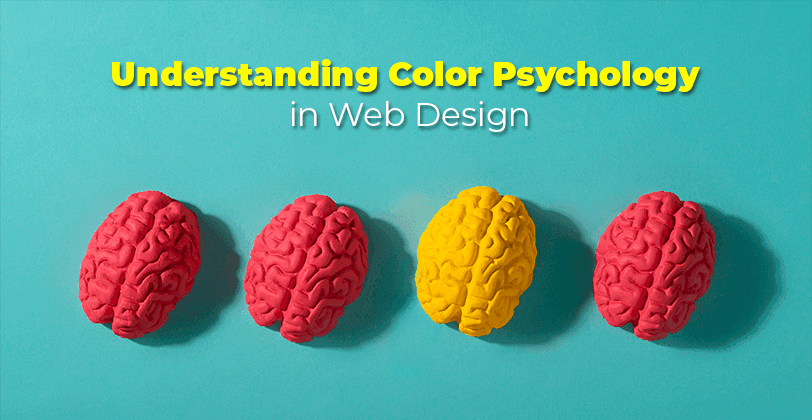
Color psychology plays a vital role in web design, influencing user behavior, emotions, and decisions. Understanding how colors impact users can help you create visually appealing websites that convert visitors into loyal customers. Whether you’re designing a green website or a modern black-and-white site, choosing the right palette is crucial for success.
How Website Color Psychology Works
Website color psychology explores how colors evoke emotions and guide user behavior. By aligning color choices with your brand identity, target audience, and goals, you can foster trust, grab attention, and increase engagement.
For instance, green websites symbolize growth and sustainability, while blue website color schemes evoke trust and professionalism. Understanding how different shades and combinations impact user perception is key to effective web design.
Things to Consider When Choosing Your Website Colors
Target Audience
Your audience's preferences play a major role in color selection. For instance:
Younger users enjoy colorful web pages with vibrant shades like orange and yellow.
Professionals might prefer muted color palettes or minimalist designs with black and white.
Cultural considerations also matter:
In Western cultures, green often symbolizes growth and health, making it ideal for mental health color palettes or green website designs.
Colors like pink and green resonate with audiences looking for confidence or tranquility.
Products and Services Offered
Your industry and offerings should dictate your website color palette:
Sage green web color or green-yellow-red color templates for a website work well for eco-friendly brands or health-focused products.
Orange website designs signify energy and creativity, perfect for entertainment and lifestyle businesses.
Personal Branding
Colors shape how users perceive your brand:
Black and white site design conveys sophistication and modernity, ideal for luxury or tech brands.
Use website examples with black, pink, yellow, and blue as inspiration for bold, memorable branding.
Colors You Can Use on Your Site
Blue
Blue represents trust, calmness, and reliability. It's one of the best colors for websites aiming to foster user confidence.
When to Use Blue on Your Site
To evoke trust colors for financial institutions or healthcare sites.
For creating calming effects in mental health color palettes.
When to Avoid Blue on Your Site
Avoid overuse in food-related websites; blue colors evoke calmness but can suppress appetite.
Too much blue can make a design feel cold and uninviting.
Red
Red is bold, energetic, and grabs attention. It’s the best sales color, often used to evoke urgency or excitement.
When to Use Red on Your Site
For CTAs that demand action, such as “Buy Now” buttons.
To attract donors, as red is a powerful color in the psychology of colors to attract donors.
When to Avoid Red On Your Site
In mental health color palettes, can feel overwhelming or aggressive.
In websites where a calming or trust-based vibe is needed, like legal or financial sites.
Yellow
Yellow symbolizes optimism and creativity but can overwhelm if not balanced properly.
When to Use Yellow on Your Site
For cheerful brandings, such as food and retail sites.
In website examples with black, pink, yellow,and blue to create vibrant energy.
When to Avoid Yellow on Your Site
Avoid pairing yellow text with light backgrounds, which can reduce readability.
It may not suit serious industries like law or finance.
Orange
Orange evokes playfulness and creativity, making it a colorful web design favorite.
When to Use Orange on Your Site
For the campaign colors meaning energy and excitement.
In outdoor web design or seasonal promotions.
When to Avoid Orange on Your Site
Overuse can make the design feel too casual or unprofessional.
Avoid pairing orange with strong colors like neon green, as this can clash visually.
Green
Green symbolizes growth, harmony, and nature. It's perfect for green website color schemes.
When to Use Green on Your Site
For environmental causes or eco-friendly brands.
In green color combinations for websites, paired with yellow for freshness or white for clarity.
When to Avoid Green on Your Site
Overuse can make your design feel monotonous or boring.
Avoid in industries where it may not align with the brand's identity, such as high-energy or entertainment sectors.
Pink
Pink is often associated with femininity, but its softer tones are versatile and calming.
When to Use Pink on Your Site
In pink and green color themes for wellness or luxury brands.
To convey elegance in purple and orange brand color themes.
When to Avoid Pink on Your Site
Avoid overuse to prevent stereotyping.
May not work in corporate or professional environments.
Purple
Purple conveys luxury, creativity, and spirituality.
When to Use Purple on Your Site
For exclusive products or purple website design showcasing creativity.
In color psychology design for meditation or art-focused sites.
When to Avoid Purple on Your Site
Overuse can overwhelm users.
In sites requiring a more conservative or neutral tone.
Brown
Brown is earthy and reliable, perfect for outdoor web designs or green web pages.
When to Use Brown on Your Site
To evoke warmth and trust in rustic or vintage designs.
For grounding tones in a modern black-and-white website.
When to Avoid Brown on Your Site
Excessive use can make the design appear dull.
Avoid in industries requiring bold, vibrant colors.
White
White stands for simplicity and cleanliness.
When to Use White on Your Site
In modern website designs with black and white, for minimalism.
To enhance readability in the best website background colors.
When to Avoid White on Your Site
Avoid using too much white, which can feel stark or empty.
Pair white with strong accent colors to maintain visual interest.
Black
Black is strong, authoritative, and elegant.
When to Use Black on Your Site
In black website color palettes for luxury or sophistication.
To create contrast in colorful page designs.
When to Avoid Black on Your Site
Overuse can make your design feel heavy or uninviting.
Avoid pairing black with muted colors, which can diminish vibrancy.
Other Elements that Complement Your Website Color Choice
Typography: Match your font styles with your color psychology design.
Imagery: Choose visuals that reflect your colorful web pages theme.
Navigation: Use contrasting colors for clarity.
FAQs About Colors in Web Design
What colors attract people's attention?
Red, orange, and yellow are the most attention-grabbing.
How many colors should a website have?
Stick to 3-5 colors for balance and harmony.
What are the best colors for a website background?
White, light gray, or muted pastels ensure readability.
Bring the Right Color to Your Site
By leveraging color psychology in web design, you can create stunning websites that engage and convert. Whether you’re designing a green website or exploring modern black-and-white site designs, choose colors that align with your brand and audience.

Brad
Author
Comments


